


The Harmonious Colour Chart Guide for Patchwork Square Projects
I’m sure most of us were taught about the colour wheel during our early school days, how primary and secondary colours compliment one another and form harmonious bonds. Well now there’s an extended art to it that is proving to be very beneficial in the world of haberdashery. In this post, we’re going to run through the science of the shades and show you how to incorporate them into your patchwork projects.

Understanding the Colour Wheel
The colour wheel begins with the three primary colours; blue, red and yellow. As you travel around the wheel we see that when the primary colours are mixed together, they produce the secondary colours; purple, orange and green. these shades can now be blended using different quantities of each colour to form further shades.
When it comes to decorating, we use the colour wheel to establish complimentary palettes to use in our home (or on logos, branding, posters etc.). Generally, palettes are accompanied by the shades of black - grey - white, as it’s important to have points of neutralisation in a space so it doesn’t become overwhelming.
Single Colour Scheme
Also known as the ‘Monochromatic’ scheme, this is the principle basis of decorating as it uses only a single colour in unison with neural shade (generally black or white). This one colour however can be used in different tints, tones and textures throughout. This scheme is traditionally used in areas where you want to create a calm atmosphere - as there are no competing colours, it forms and ambience of relaxation. It’s a good idea to use this scheme in bathrooms, bedrooms, small rooms or hallways.
Contrasting Colour Scheme

If you look at the wheel, the two colours opposite one another are ‘contrasting’. Using this scheme will introduce an interplay of either dynamic vibrants or playful muted tones (depending on which shades you opt for) and create a complimentary contrast for your space. Living rooms, children bedrooms and kitchens are ideal for using this scheme.
Harmonious Colour Scheme

The neighbouring three colours on the colour wheel represent the ‘Analogous’ or ‘Harmonious’ scheme. This scheme comprises of serene colours that rhythmically flow from one to the other - ideal for use in rooms that are not divided by walls or doors or for spaces that where you’d like to create a natural flow of colour - such as a study area joining a living room.
Dynamic Colour Scheme

#This is when three colours form a triangle on the colour wheel - it’s otherwise known as a ‘Triadic’ scheme. This scheme brings colours together that are dynamically and significantly different - they clash and contrast for diversity. Family rooms and playrooms will thrive off of a dynamic scheme - bringing invigorating colour to an active atmosphere. Let one colour dominate, then let the other two form as accents.
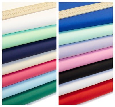
How to use the Colour Wheel in your Textiles


At Hot Pink Haberdashery, we use the colour wheel to help us in deciding which coloured fabrics to put with each other in our textiles. For example, making a pillow using our lovely patchwork squares can be made easier by referring to the colour chart to decide which prints and fabrics are going to look nice together! For example, we can see from the chart that pink, purple and blue form an Analogous scheme which means they’ll naturally look great together! We have our pastel package that brings these muted shades together along with their floral and spotty prints, ideal for straightaway getting stuck in on your projects.
On the other hand we also have a selection of specially chosen ‘brights’ if you’re a lover of vibrant primary’s! These look especially great on cushions in your living room - pile them up on your plain sofa to really bring out the best in their prints! If your suite is navy, create a patchwork pillow of lemons and gold tones to create a successful contrast!
Patchwork Projects
Have a look at the following projects you can take on using your patchwork squares:
- Blanket or duvet set
- Pillows and cushions
- Kindle case
- Curtains
- Pin cushion
- Tote bag
- Oven mitts
- Drawstring bag
- Ironing board cover
- Customise your jeans or denim jacket
- Clutch bag
- Placemats
- Tea cosy etc.
There are so many ways to incorporate your squares, and now you can match them perfectly into your home colour schemes!
Leave a comment